Posts

Breathtaking...

Image
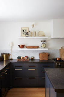
This picture stopped me in my tracks when I saw it. The natural color combinations are breathtaking!! I love navy blue as a main color and yellow as an accent! What are your thoughts? I used a color similar to this from C2 called Brigand in my half bath and I'm still in love with it!!

5 Design Trends to Remember

Image
#1 Removable Wallpaper This surface material is easy to apply and therefore easy to change when you feel you need to. Accent wall seem like to much? Consider lining the back of a bookshelf instead. #2 Live Plants Live plants can help bring life and happiness to a space, and good for your health to boot! #3 Window Treatments These should be hung a couple of inches ABOVE window including trim. If you are able to, extend the hanging rod past the window on both sides. This creates the illusion of a bigger window and allows more natural light into the room. #4 Adding Texture and/or Color There are a few ways to do this. One could be bright pops of color in your accent pillows or with a plush throw blanket. Another way may be to add woven baskets to your plants or add storage for your magazines. #5 Lighting Don't forget to include all three layers of lighting to your room.      A Ambient (general/overhead)      B Task      C Accent (focal point)

Trim...color?

Image
I've talked about one of my favorite Benjamin Moore colors, Stone Hearth for so long now you're probably sick of it. But in a blog I follow Seeking Lavender Lane  she uses the color to accent her woodwork and doors with. And you know what? It looks amazing, maybe she's on to something? So if you're a fan of lighter color walls, maybe warmer trim work is an option?

Wallpaper

Image
So  wallpaper is making a comeback? Well my mindset on this has always been negative. In my line of work I OFTEN come across those with wallpaper removal horror stories and I am trying to advise them on all things with removing wallpaper,  DIY . That being said, wallpaper has changed. a lot! Gone are the borders and nautical prints. It seems to be used as more of an accent, whether that be one wall or the backing of a bookcase, bold or soft. When I first moved into my home 10+ years ago every room was covered in wallpaper, no joke! I hated it!! Plus, long story short we moved into an older home (plaster walls) that had been moved onto a new foundation after our city suffered from a flood. Because of this, there were cracks above doorways and had we tried to remove that paper we would have ended up damaging the walls and potentially needing to then re-drywall, which as first time homebuyers we couldn't afford to do. So what did we do? We primed and painted over ALL OF IT! I

Is that stone?

Image
If you didn't see this post via Domino magazine I felt it true enough to share- This Material Is on the Brink of a Major Comeback, Says Leanne Ford. It is a more cost  effective option to stone with a fairly similar look. IN PARTNERSHIP WITH Like all great design trends of the past,  Formica  is poised for a comeback. The easy-to-clean material that once comprised almost every private and public countertop in America is in the middle of a renaissance, and guess what? It’s honestly more beautiful than ever. In lieu of pricey stone and granite, laminate is quickly becoming the It material for budget-conscious home renovators. Just ask designer and renovation expert Leanne Ford of HGTV’s  Restored by the Fords , who collaborated with Formica on a curated  capsule collection  that launches this month. “I blame landlords for giving laminate a bad name,” Ford says with a grin. “There are really modern, clean options to play with outside what we think of.” Asid

Two-tone cabinets

Image
A trend we keep seeing in the interior design industry is two-toned cabinets. I feel I can add value to this trend as I am a strong believer in this trend but not necessarily by choice. My husband and I did a kitchen remodel a few years ago only by the idea of a fellow co-worker and now good friend. Although I work with a lot of talented designers, this one in particular was extremely talented with kitchens. She was able to see past my small, outdated kitchen to the beauty it is today and believe it or not she  chose two-toned cabinets for me. I left the design (mostly) in her hands. I had white painted cabinets previously-both uppers and lowers and had mentioned my complaint of my lowers never staying clean! At the time we had a large dog and two small children so the white seemed to always look dirty! Her solution-a darker cabinet base and I've never looked back! With appliances moved around and a wall removed (some sweat and tears) I LOVE my new open kitchen!! Cabinets,

Greige

Image
Okay friends, I have this talk daily while at work...DAILY. In case you didn't know, I live in North Dakota and in ND it feels like winter 9 months out of the year! Maybe that's an exaggeration But truthfully when it does snow, it doesn't melt. It is cold enough here for the snow to stick around for awhile. Ok ok moving on...the trend that's still hitting hard up here is gray. Grays are hard no matter what because of how they change with lighting but can be difficult especially when you want gray to feel warm. So here's my spiel, if I said it once I'll say it again- builder beige from 10 years ago→ 'Greige' BM Stone Hearth →traditional "cooler" gray            GOLD                                                                                          BLUE   So another reason I'm on this greige high horse is because I actually took the plunge and decided on a greige for myself, got the paint and had the hubby paint over his c