Grays, Grays and Grays OH MY!
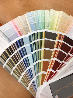
Lets talk paint color...and with that comes a conversation I have almost everyday, GRAYS!
When someone asks me "What's your favorite gray?" I simply reply "Take a seat".
(with a smile of course) Up here in north country we are about 5 years (if not more) from the trends coast to coast. We also endure cold weather for about 9 months out of the year. YIKES! This in turn translates to being forced inside, loving our homes and of course warmer colors!
Because of this, my favorite Benjamin Moore color is #984 out of the classic collection, Stone Hearth. It's more of a greige (grey-beige) so it keeps its warmth yet updates the space.
I've learned the important thing with gray is to know your undertone and know what you would rather see. Let me break it down for you...
1. Red undertone: looks more brown
2. Blue undertone: looks more blue
3. Green undertone: looks more green
I have found that most people assume a standard gray sample from the store, taken home and put on the wall, looks blue. First piece of advice: shop somewhere you trust and ASK for help! I always suggest Pinterest (the world's largest catalog of ideas) for ideas but just to get your thoughts rolling. Remember colors online and in print WILL look different in person. On that note, the color will also look different in your lighting at home. Which is why it is important to take a color swatch or sample home with you before a gallon of paint to make sure you still love the color.
Revere Pewter #HC-172 is Benjamin Moores #1 color on-line but I sell it with such caution because it changes color in different lighting. I've seen it look gray, yes but also green and cream depending on the light.
Edgecomb Gray #HC-173 to me is a stable Revere Pewter, meaning it doesn't change as much. Both colors are a part of Benjamin Moore's Historical Collection and share the same card swatch which is good for comparison.

Lastly I talk trim color. A lot of North Dakotans are dealing with golden oak trim. And changing your trim color (to let's say white) is a BIG JOB!!!
This needs to be taken into consideration because the finish on most golden oak yellows over time or has a tendancy to almost look orange. This in turn will "fight" with a cooler color. This means a blue or green will look more prominent because it wants the attention and doesn't want to share with your yellowish oak! Which is why a warmer gray (greige) works better.
If you're lucky enough to have white trim and are in love with the gray trend, pat yourself on the back because the doors of options are wide open!
It's amazing how the color gray is percieved outside of paint. For example in food- it's amost never requested as a cake color and their truly aren't many items that are naturally gray. But there seriously are 50 shades of gray 😉 so take your time and choose wisely!
Remember, when push comes to shove, it's only paint!

When someone asks me "What's your favorite gray?" I simply reply "Take a seat".
(with a smile of course) Up here in north country we are about 5 years (if not more) from the trends coast to coast. We also endure cold weather for about 9 months out of the year. YIKES! This in turn translates to being forced inside, loving our homes and of course warmer colors!
Because of this, my favorite Benjamin Moore color is #984 out of the classic collection, Stone Hearth. It's more of a greige (grey-beige) so it keeps its warmth yet updates the space.
 |
| 984 Stone Hearth |
I've learned the important thing with gray is to know your undertone and know what you would rather see. Let me break it down for you...
1. Red undertone: looks more brown
2. Blue undertone: looks more blue
3. Green undertone: looks more green
I have found that most people assume a standard gray sample from the store, taken home and put on the wall, looks blue. First piece of advice: shop somewhere you trust and ASK for help! I always suggest Pinterest (the world's largest catalog of ideas) for ideas but just to get your thoughts rolling. Remember colors online and in print WILL look different in person. On that note, the color will also look different in your lighting at home. Which is why it is important to take a color swatch or sample home with you before a gallon of paint to make sure you still love the color.
Revere Pewter #HC-172 is Benjamin Moores #1 color on-line but I sell it with such caution because it changes color in different lighting. I've seen it look gray, yes but also green and cream depending on the light.
Edgecomb Gray #HC-173 to me is a stable Revere Pewter, meaning it doesn't change as much. Both colors are a part of Benjamin Moore's Historical Collection and share the same card swatch which is good for comparison.
 |
| HC-173 Edgecomb Gray |
Lastly I talk trim color. A lot of North Dakotans are dealing with golden oak trim. And changing your trim color (to let's say white) is a BIG JOB!!!
This needs to be taken into consideration because the finish on most golden oak yellows over time or has a tendancy to almost look orange. This in turn will "fight" with a cooler color. This means a blue or green will look more prominent because it wants the attention and doesn't want to share with your yellowish oak! Which is why a warmer gray (greige) works better.
If you're lucky enough to have white trim and are in love with the gray trend, pat yourself on the back because the doors of options are wide open!
It's amazing how the color gray is percieved outside of paint. For example in food- it's amost never requested as a cake color and their truly aren't many items that are naturally gray. But there seriously are 50 shades of gray 😉 so take your time and choose wisely!
Remember, when push comes to shove, it's only paint!


Comments
Post a Comment